Barbaric Basics: Building Flexible Layouts With Flexbox
With Barbaric Basics I brush up on basic techniques, practices and APIs. Come along and get them refreshed you too. Who knows? You may even learn something new!
Today we live in a world of many devices, many resolutions, many form factors and as such it is more challenging than ever to build websites that provide an awesome experience in all of these different and ever-changing conditions.
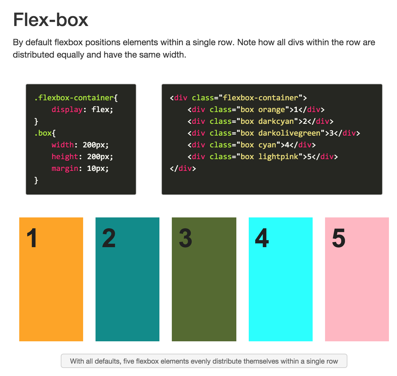
Fortunately, HTML5 brings with it a couple of new techniques that let us developers create flexible layouts with less hassle than ever before: flexbox and grid. I have created a tutorial/walkthrough that I hope will get help you start getting acquainted with Flexbox, the most mature of these two new layout systems. I hope you’ll enjoy it!

Flexbox is a stable standard and is supported by all modern browsers (>IE10), so there’s no reason not to start using it today.
And here are some additional references if you want to learn some more!

Written by Jaime González García , dad, husband, software engineer, ux designer, amateur pixel artist, tinkerer and master of the arcane arts. You can also find him on Twitter jabbering about random stuff.
