Building Beautiful Web Apps With Angular Material - Part II
This is the second part of a beautifully crafted narration inspired by a talk I did at Swetugg 2017 on Angular Material. Missed the first part? Go here
In the first part of this series we talked about the importance of aesthetics and how beauty improves user experience. But building beautiful apps is kind of hard so it’s nice to get some help from awesome visual languages like Material Design and libraries of components like Angular Material. Angular Material brings all the awesomeness of Material Design to your Angular apps. It provides numerous components that work seamlessly with Angular and which can both boost your productivity and let you create truly beautiful web apps.
To showcase some of the components that you have available today, we are going to build this dating app: Derek Zoolander’s Center for Models Who Can’t Find Love.
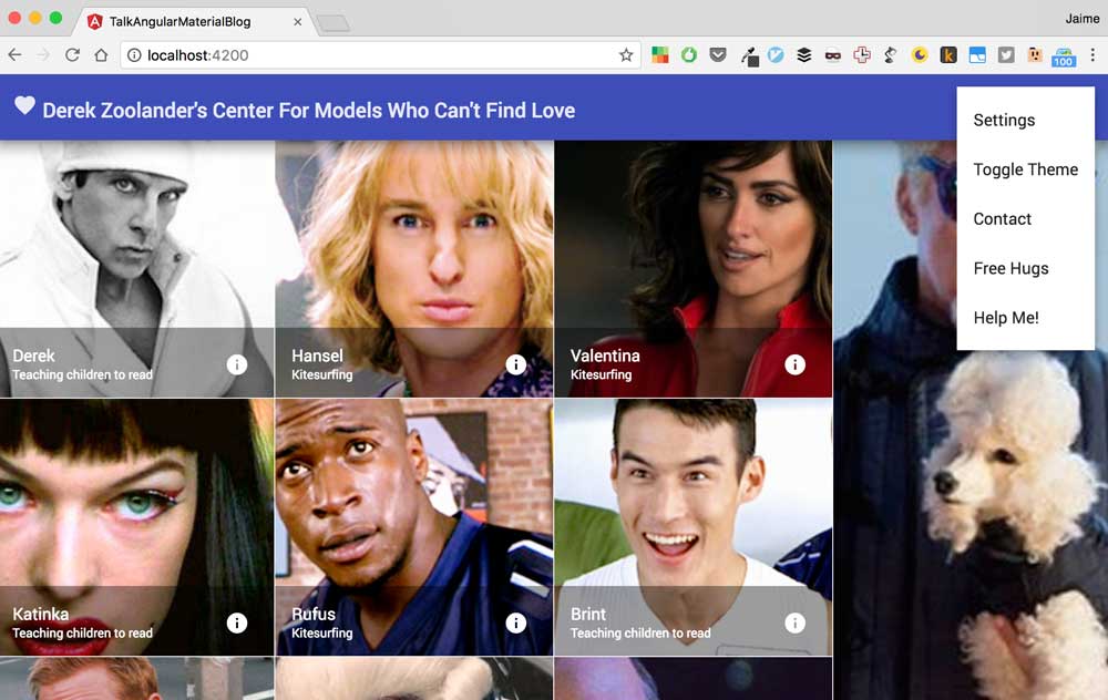
Let’s get started!
Creating a New Angular App with the Angular CLI
The easiest and most straightforward way to create a new Angular app is using the Angular CLI. If you haven’t installed it yet, it’s super easy with npm:
$ npm install -g @angular/cliFor our dating site we’ll create a new application using the CLI by typing the following snippet:
$ ng new dating-site-angular-material --style=scssThe new command will create a brand new Angular application with a great development environment using TypeScript and SASS. If you inspect the dating-site-angular-material folder you’ll discover that you have a barebones folder structure with your app located in the src folder. A good habit to test that everything works as it should, is to run your Angular app. You can do that by typing the following:
$ cd dating-site-angular-material
$ ng serve
This will start webpack development server that will host your app typically in http://localhost:4200. You can navigate to the address displayed in the command line and you should be able to see App Works! on the screen. Next we’ll add the angular material and the angular flex layout engine to your application also using npm:
$ npm install --save @angular/material @angular/flex-layoutBefore you can start using them in your Angular App you need to add them to your application NgModule. An NgModule let’s you wrap and distribute components, directives, pipes, services and declare your dependencies to other modules. It also represents the components, directives, pipes, services and external modules that you can use within that module. In this case we’ll only have a module located in src/app/app.module.ts. When you open this file you’ll see the following:
import { BrowserModule } from '@angular/platform-browser'
import { NgModule } from '@angular/core'
import { FormsModule } from '@angular/forms'
import { HttpModule } from '@angular/http'

import { AppComponent } from './app.component'

@NgModule({
  declarations: [AppComponent],
  imports: [BrowserModule, FormsModule, HttpModule],
  providers: [],
  bootstrap: [AppComponent],
})
export class AppModule {}
Which is a very basic module with just a single component AppComponent that’ll be the entry point to your application. This module also allows you to take advantage of Angular Forms and Http services by virtue of the modules that are imported (BrowserModule, FormsModule, HttpModule). Using the same convention we will add Angular Material and Angular Flex Layout to our application so we import the MaterialModule and FlexLayoutModule and include them like this:
import { BrowserModule } from '@angular/platform-browser'
import { NgModule } from '@angular/core'
import { FormsModule } from '@angular/forms'
import { HttpModule } from '@angular/http'

// Add Material Design and Angular Flex Layout
import { MaterialModule } from '@angular/material'
import { FlexLayoutModule } from '@angular/flex-layout'

import { AppComponent } from './app.component'

@NgModule({
  declarations: [AppComponent],
  imports: [
    BrowserModule,
    FormsModule,
    HttpModule,
    MaterialModule.forRoot(),
    FlexLayout.forRoot(),
  ],
  providers: [],
  bootstrap: [AppComponent],
})
export class AppModule {}
We’ll also select one of Angular Material pre-built themes to define the basic styles of our application. Open src/styles.scss and add the following:
@import '~@angular/material/core/theming/prebuilt/indigo-pink.css';And now we’re ready to start writing our dating site! Yey! (You can find which prebuilt themes are available on Github).
We Start With The Basic Layout
Let’s start by creating the skeleton for the UI of the app. The dating app will have a toolbar, a central area where we’ll have all the models displayed within a grid and a sidenav with model details. In gross terms it’ll be something like this:
<!-- toolbar -->
<!-- gridlist with models-->
<!-- sidenav with details -->
Our application right now only has a single component the AppComponent located in src/app/app.component.ts. That component’s template src/app/app.component.html is what we’re seeing in the screen when we serve the application via ng serve. For the sake of simplicity we are going to begin by writing our whole application inside that single component. We’ll define our application user interface within the template file src/app/app.component.html and the supporting logic in the component underneath src/app/app.component.ts.
The first thing that we want to add is an element that will represent the shell of our application:
<section class="app">
</section>
Because we want the shell to take the complete screen in height we’ll add these styles in styles.scss:
// some basic resets
body {
  padding: 0;
  margin: 0;
  font-family: Roboto, sans-serif;
}

.app {
  height: 100vh; // emmet h100vh
}Now we can add a toolbar using the md-toolbar component:
<section class="app">
    <md-toolbar color="primary" class="mat-elevation-z10">
      Toolbar
    </md-toolbar>
</section>
The color of the toolbar will be the primary color for our theme and we add the mat-elevation-z10 to add that 3-dimensionality characteristic of Material Design. In order for the box shadow to be displayed correctly we’ll need to add a snippet in our styles:
md-toolbar {
  z-index: 10; // emmet z10
}
We continue with the main content of the app by adding a md-sidenav-container for the models and a md-sidenav inside it to contain the model details:
<section class="app">
    <md-toolbar color="primary" class="mat-elevation-z10">
      Toolbar
    </md-toolbar>

  <md-sidenav-container>
    <md-sidenav mode="side" align="end" opened class="mat-elevation-z6">
        details
    </md-sidenav>

    models
  </md-sidenav-container>
</section>
The md-sidenav will be on the side of our layout and to the right (end). We’ll also update our styles so that the sidenav takes 40% of our viewport in width:
md-sidenav {
  width: 40vw; // emmet w40vw
}
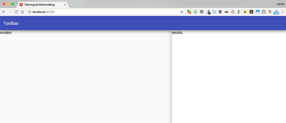
If you take a look at the application right now using ng serve this is what you’ll see:

This is not exactly what we want. Even though the <section class="app"> takes the whole screen, its children don’t. As a result the toolbar and the sidenav container appear on the top of the screen. Let’s remedy that using the Angular Flex Layout. What we want is for the toolbar to take its natural size and for the sidenav container to take the rest of the screen. We can achieve that by updating our html template like this:
<!-- flex container displaying children as a column -->
<section class="app flex-container" fxLayout="column" fxLayoutAlign="start stretch">

  <md-toolbar color="primary" class="mat-elevation-z10">
    Toolbar
  </md-toolbar>

  <!-- this flex item takes the rest of the screen in height -->
  <md-sidenav-container fxFlex>
    <md-sidenav mode="side" align="end" opened class="mat-elevation-z6">
        details
    </md-sidenav>

    models
  </md-sidenav-container>
</section>
The class flex-container declares the top section as a flex container, the fxLayout tells the container to display its hildren within columns and the fxLayoutAlign to do so starting from the top and stretching them in width. Finally the fxFlex attribute in the md-sidenav-container tells the element to take the remainder of the screen in height. If you take a look at your app right now you’ll appreciate how it looks as it should:
Let’s complete our basic layout by adding some tabs inside the sidenav. We’ll add three: an About with some basic model details, a Messages where we’ll be able to see messages sent to the model and a Photos tab where the model will be able to share cat pictures. The Angular Material component that we use for tabs is the md-tab-group and the md-tab:
<!-- flex container displaying children as a column -->
<section class="app flex-container" fxLayout="column" fxLayoutAlign="start stretch">

  <md-toolbar color="primary" class="mat-elevation-z10">
    Toolbar
  </md-toolbar>

  <!-- this flex item takes the rest of the screen in height -->
  <md-sidenav-container fxFlex>
    <md-sidenav mode="side" align="end" opened class="mat-elevation-z6">
      <!-- adding some tabs for the details -->
      <md-tab-group>
        <md-tab label="About"></md-tab>
        <md-tab label="Messages"></md-tab>
        <md-tab label="Photos"></md-tab>
      </md-tab-group>
    </md-sidenav>

    models
  </md-sidenav-container>
</section>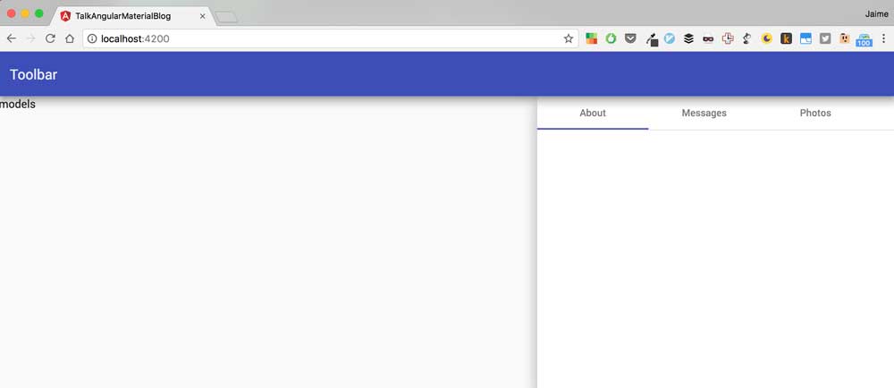
We’ll continue with the toolbar: let’s set the title of our app and spice things up with a heart icon.
  <md-toolbar color="primary" class="mat-elevation-z10">
    <md-icon>favorite</md-icon>
    Derek Zoolander's Center for Models Who Can't Find Love
  </md-toolbar>
In order for the material design icons to work, we’ll need to add the material design icon font. We can do that inside our index.html:
<!doctype html>
<html>
<head>
  <meta charset="utf-8">
  <title>TalkAngularMaterialBlog</title>
  <base href="/">

  <meta name="viewport" content="width=device-width, initial-scale=1">
  <link rel="icon" type="image/x-icon" href="favicon.ico">

  <!-- Add material design icon font here -->
  <link href="https://fonts.googleapis.com/icon?family=Material+Icons" rel="stylesheet">

</head>
<body>
  <app-root>Loading...</app-root>
</body>
</html>
Yey! We completed the skeleton. Let’s now focus on the grid of models!
Behold a Grid of Models!
Alright, we want to display a grid of models with names and statuses so that we can find our other half with one single glance. In order to do that we’re going to use a component that is called an md-grid-list. Inside the md-sidenav-container we type the following:
  <md-grid-list cols="4" rowHeight="250px">
      models here
  </md-grid-list>
This is going to create a grid list of 4 columns where each row has a fixed height of 250px. The next step is to show the models as tiles within this list. We use the md-grid-tile component together with an *ngFor to create a tile for each of the models that we want to display:
  <md-grid-list cols="4" rowHeight="250px">
    <md-grid-tile *ngFor="let model of models">
        <img src="assets/{{model.name}}.png" alt="model {{model.name}}">
    </md-grid-tile>
  </md-grid-list>
These tiles will be very simple and just contain an image for each model. Notice how we store these images inside the assets folder within our project. But where do these models come from?
In order to be able to display the models in our component we need to expose a models variable in our component and load those models from somewhere. In a real world application they’d probably come from a service hosted in a server somewhere in the internets. For this example we’re going to just use an in-memory array that will be contained within an Angular service.
First things first, we need the concept of a Model within our application, that is, our domain model that represents the problem our application is trying to solve. We create a models.ts file to hold this simple domain model that will contain two classes Model and Message:
export class Model {
  name: string
  status: string
  about: string
  messages: Message[]

  rows: number
  cols: number
}

export class Message {
  who: string
  content: string
}
Now let’s create a quick service using the angular cli. From the command line write:
$ ng g service modelsThe angular cli will create a brand new service for you:
installing service
  create src/app/models.service.spec.ts
  create src/app/models.service.ts
  WARNING Service is generated but not provided, it must be provided to be used
And upon creation it will look like this:
import { Injectable } from '@angular/core'

@Injectable()
export class ModelsService {
  constructor() {}
}
This new service will represent a data access layer that will provide the rest of the application with models and hide where these models are coming from: a database? local storage? a black hole? Or an in-memory array. The public interface for the service will be a single method getAll that will return an array of models.
import { Injectable } from '@angular/core'
import { Model } from './models'

@Injectable()
export class ModelsService {
  constructor() {}

  models: Model[] = [
    {
      name: 'Derek',
      status: 'Teaching children to read',
      about: "I'm a model",
      messages: [],
      rows: 1,
      cols: 1,
    },
    {
      name: 'Hansel',
      status: 'Kitesurfing',
      about: "I'm a model",
      messages: [],
      rows: 1,
      cols: 1,
    },
    {
      name: 'Valentina',
      status: 'Kitesurfing',
      about: "I'm a model",
      messages: [],
      rows: 1,
      cols: 1,
    },
    {
      name: 'Mugatu',
      status: 'Designing the masterplan',
      about: "I'm a tirant",
      messages: [],
      rows: 3,
      cols: 1,
    },
    {
      name: 'Katinka',
      status: 'Teaching children to read',
      about: "I'm a model",
      messages: [],
      rows: 1,
      cols: 1,
    },
    {
      name: 'Rufus',
      status: 'Kitesurfing',
      about: "I'm a model",
      messages: [],
      rows: 1,
      cols: 1,
    },
    {
      name: 'Brint',
      status: 'Teaching children to read',
      about: "I'm a model",
      messages: [],
      rows: 1,
      cols: 1,
    },
    {
      name: 'Meekus',
      status: 'Teaching children to read',
      about: "I'm a model",
      messages: [],
      rows: 1,
      cols: 1,
    },
    {
      name: 'EvilDJ',
      status: 'Teaching children to read',
      about: "I'm a model",
      messages: [],
      rows: 1,
      cols: 1,
    },
    {
      name: 'JPPrewit',
      status: 'Teaching children to read',
      about: "I'm a model",
      messages: [],
      rows: 1,
      cols: 1,
    },
  ]

  getAll(): Model[] {
    return this.models
  }
}We then need to register the service within our app.module.ts:
// ...other imports...

// 1. import service
import { ModelsService } from './models.service'

@NgModule({
  declarations: [AppComponent],
  imports: [
    BrowserModule,
    FormsModule,
    HttpModule,
    MaterialModule.forRoot(),
    FlexLayoutModule.forRoot(),
  ],
  // 2. add to providers
  providers: [ModelsService],
  bootstrap: [AppComponent],
})
export class AppModule {}
And finally we can inject it in our app.component.ts constructor and obtain the array of models while initializing the component as follows:
import { Component, OnInit } from '@angular/core';
import { ModelsService } from './models.service';
import { Model } from './models';

@Component({
  selector: 'app-root',
  templateUrl: './app.component.html',
  styleUrls: ['./app.component.scss']
})
export class AppComponent implements OnInit{
  title = 'app works!';
  models: Model[] = [];

  constructor(private modelsService: ModelsService) {}

  ngOnInit(){
    this.models = this.modelsService.getAll();
  }
}
If you now take a look at your app being rendered on the browser you’ll see lots of models orderly displayed as tiles within a 4 column grid! Yey!
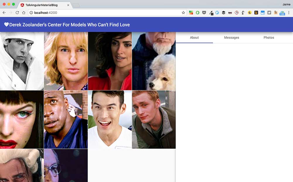
Let’s take a look at the template that’s producing these results once again:
  <md-grid-list cols="4" rowHeight="250px">
    <md-grid-tile *ngFor="let model of models">
        <img src="assets/{{model.name}}.png" alt="model {{model.name}}">
    </md-grid-tile>
  </md-grid-list>
We will continue by closing the sidenav for the time being so that we can focused completely on the models. You can do that by removing the opened attribute from the sidenav element. Much better! Now, if you pay attention to the screen you’ll be able to appreciate how Mugatu, in the top right corner is not displayed in all his glory. We’re going to give him more space by taking advantage of the rowspan and colspan properties within the md-grid-tile component. We can update the md-grid-tile template as follows:
  <md-grid-list cols="4" rowHeight="250px">
    <md-grid-tile *ngFor="let model of models" [rowspan]="model.rows" [colspan]="model.cols">
        <img src="assets/{{model.name}}.png" alt="model {{model.name}}">
    </md-grid-tile>
  </md-grid-list>
And voilá! Now Mugatu’s photo spans through three rows and we can see him completely. Let’s continue adding more information to the tiles with a footer. This footer will allow us to learn each model’s name, what models are up to and even provide a button to find out more information about the models by opening their details within the sidenav. Add the following md-grid-tile-footer element to the grid list:
  <md-grid-list cols="4" rowHeight="250px">
    <md-grid-tile *ngFor="let model of models" [rowspan]="model.rows" [colspan]="model.cols">
        <img src="assets/{{model.name}}.png" alt="model {{model.name}}">

        <!-- new footer! -->
        <md-grid-tile-footer>
            <h3 md-line>{{model.name}}</h3>
            <span md-line>{{model.status}}</span>
            <button md-icon-button (click)="showDetails(model)">
                <md-icon>info</md-icon>
            </button>
        </md-grid-tile-footer>

    </md-grid-tile>
  </md-grid-list>
This will create a footer that will display the model’s name, its status and a button that when clicked (remember that the (click) creates and event binding in Angular) will call the showDetails method in the underlying component. The new grid will look like this:

Lots of models kitesurfing and teaching children how to read! Beautiful! Now we need to handle the click event in the component app.component.ts. We update our component to include that method:
@Component({
  selector: 'app-root',
  templateUrl: './app.component.html',
  styleUrls: ['./app.component.scss']
})
export class AppComponent implements OnInit{
  models: Model[] = [];

  constructor(private modelsService: ModelsService) {}

  ngOnInit(){
    this.models = this.modelsService.getAll();
  }

  showDetails(model: Model){
    // 1. set selected models
    // 2. open sidenav
  }
}
Remember, we want to open the details for a specific model. So we first select the model passed as an argument to the method and then we open the sidenav. Selecting the model is easy, we just create a new property selectedModel within AppComponent:
@Component({
  selector: 'app-root',
  templateUrl: './app.component.html',
  styleUrls: ['./app.component.scss']
})
export class AppComponent implements OnInit{
  models: Model[] = [];
  selectedModel: Model;

  constructor(private modelsService: ModelsService) {}

  ngOnInit(){
    this.models = this.modelsService.getAll();
  }

  showDetails(model: Model){
    // 1. set selected models
    this.selectedModel = model;
    // 2. open sidenav
  }
}
But in order to open the sidenav we need a reference to it within our component. To achieve that we will use the ViewChield decorator that let’s us query the component’s template from within the component. We start by creating a local template variable #sidenav within the app.component.html template for the md-sidenav-component:
    <md-sidenav mode="side" align="end" class="mat-elevation-z6" #sidenav>
      <!-- adding some tabs for the details -->
      <md-tab-group>
        <md-tab label="About"></md-tab>
        <md-tab label="Messages"></md-tab>
        <md-tab label="Photos"></md-tab>
      </md-tab-group>
    </md-sidenav>
Within the app.component.ts we use the ViewChild to get a reference to the sidenav and close it within the showDetails method:
import { Component, OnInit, ViewChild} from '@angular/core';
import { MdSidenav } from '@angular/material';
import { ModelsService } from './models.service';
import { Model } from './models';

@Component({
  selector: 'app-root',
  templateUrl: './app.component.html',
  styleUrls: ['./app.component.scss']
})
export class AppComponent implements OnInit{
  models: Model[] = [];
  selectedModel: Model;
  @ViewChild('sidenav') sidenav: MdSidenav;

  constructor(private modelsService: ModelsService) {}

  ngOnInit(){
    this.models = this.modelsService.getAll();
  }

  showDetails(model: Model){
    // 1. set selected models
    this.selectedModel = model;
    // 2. open sidenav
    this.sidenav.open();
  }
}
And to be able to verify that everything works we’ll add some initial details in our first tab, the model name:
    <md-sidenav mode="side" align="end" class="mat-elevation-z6" #sidenav>
      <!-- adding some tabs for the details -->
      <md-tab-group>
        <md-tab label="About">{{selectedModel?.name}}</md-tab>
        <md-tab label="Messages"></md-tab>
        <md-tab label="Photos"></md-tab>
      </md-tab-group>
    </md-sidenav>
If you now test your app in the browser you’ll appreciate how the sidenav opens whenever you click the info button for each model. You’ll also see how the name within the About tab changes for each different model. Good job!!!
You Don’t Like Adding a Reference to an MdDialog Inside Your Component? Neither Do I!!
If you don’t like to put too much template related logic inside your component and you want to keep as much of it as you can in your template you can use this alternative:
<button md-icon-button (click)="showDetails(model);sidenav.open()">
    <md-icon>info</md-icon>
</button>
Where the complete template for the md-grid-list component looks like this:
  <md-grid-list cols="4" rowHeight="250px">
    <md-grid-tile *ngFor="let model of models" [rowspan]="model.rows" [colspan]="model.cols">
        <img src="assets/{{model.name}}.png" alt="model {{model.name}}">
        <md-grid-tile-footer>
            <h3 md-line>{{model.name}}</h3>
            <span md-line>{{model.status}}</span>
            <button md-icon-button (click)="showDetails(model);sidenav.open()">
                <md-icon>info</md-icon>
            </button>
        </md-grid-tile-footer>
    </md-grid-tile>
  </md-grid-list>
And the AppComponent logic becomes a lot simpler:
import { Component, OnInit } from '@angular/core';
import { ModelsService } from './models.service';
import { Model } from './models';

@Component({
  selector: 'app-root',
  templateUrl: './app.component.html',
  styleUrls: ['./app.component.scss']
})
export class AppComponent implements OnInit{
  models: Model[] = [];
  selectedModel: Model;

  constructor(private modelsService: ModelsService) {}

  ngOnInit(){
    this.models = this.modelsService.getAll();
  }

  showDetails(model: Model){
    this.selectedModel = model;
  }
}
Filling in Those Details With Cards
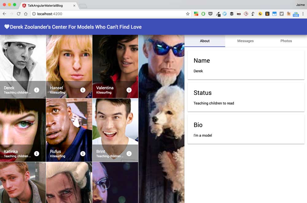
Now that we have completed the grid of models let’s take a closer look into the details. We will continue our dating app by displaying more details about each model using the md-card component. Within the About tab we will show three bits of information within cards: the model’s name, status and bio. We update the template as follows:
<md-tab label="About">
  <md-card>
    <md-card-title>Name</md-card-title>
    <md-card-content>{{selectedModel?.name}}</md-card-content>
  </md-card>
  <md-card>
    <md-card-title>Status</md-card-title>
    <md-card-content>{{selectedModel?.status}}</md-card-content>
  </md-card>
  <md-card>
    <md-card-title>Bio</md-card-title>
    <md-card-content>{{selectedModel?.about}}</md-card-content>
  </md-card>
</md-tab>
If you take a look at your web UI right now after clicking on one of the models you’ll be disappointed to see the cards crammed inside the tab. Let’s do some re-styling to add some breathing room. First we take advantage of flex layout to define the layout of the cards:
  <section class="flex-container" fxLayout="column" fxLayoutAlign="start stretch">
    <md-card>
      <md-card-title>Name</md-card-title>
      <md-card-content>{{selectedModel?.name}}</md-card-content>
    </md-card>
    <md-card>
      <md-card-title>Status</md-card-title>
      <md-card-content>{{selectedModel?.status}}</md-card-content>
    </md-card>
    <md-card>
      <md-card-title>Bio</md-card-title>
      <md-card-content>{{selectedModel?.about}}</md-card-content>
    </md-card>
  </section>
And then we add some whitespace:
md-card {
  margin: 12px;
}
And this is how it looks:
We Shall Also Close The Sidenav!
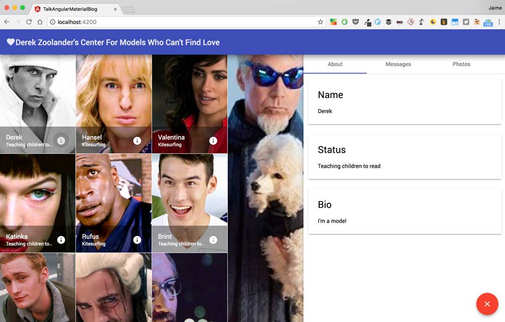
We can open the sidenav with details but we can’t close it. Let’s fix that by adding a button to close the details. We’ll use a material design floating action button also known as fab in conoisseur circles. Within the same tab we add a footer for tab actions:
  <section class="tab-actions">
    <button md-fab color="warn" (click)="sidenav.close()">
      <md-icon>close</md-icon>
    </button>
  </section>
This will show a floating action button inside the tab with a warning color and when you click it the sidenav will be closed. Unfortunately, the button appears in the leftmost corner right now and we want to have it floating in the rightmost bottom corner. Styling time!
First we will extend the tab content height to take the remaining part of the screen after removing the toolbar and tab headers:
$md-toolbar-height: 64px;
$md-tab-header-height: 48px;
.mat-tab-body-content {
  height: calc(100vh - #{$md-tab-header-height} - #{$md-toolbar-height});
}
And then we define the style for the tab actions:
.tab-actions {
  display: inline-block;
  position: fixed;
  bottom: 20px;
  right: 20px;
}
The floating action button should now be floating on the right spot in all its glory:
Send me a Message Maybe
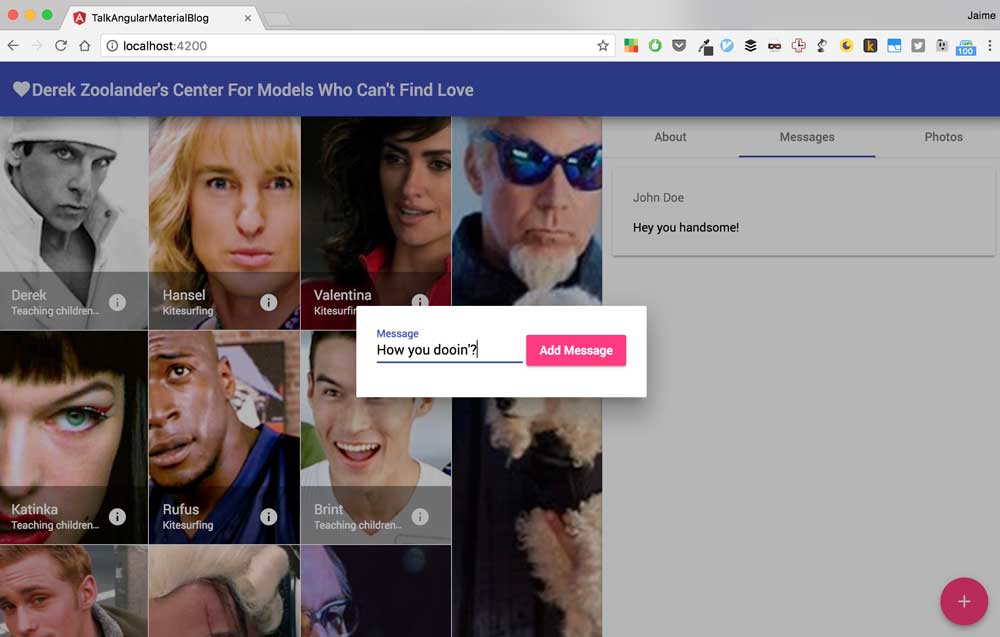
The next thing that we’d like to be able to do is to send messages to a model that we fancy so that we can start that meaningful long term relationship we all seek and yearn for. In order to do that, we are going to add another fab button in the messages tab that will open a dialog where we can enter a message:
<md-tab label="Messages">

  <footer class="tab-actions">
    <button md-fab color="accent" (click)="addMessage()">
      <md-icon>add</md-icon>
    </button>
  </footer>
</md-tab>
And we’ll display the list of existing messages for the model that has been selected:
<md-tab label="Messages">
  <section class="flex-container" fxLayout="column" fxLayoutAlign="start stretch">
    <md-card *ngFor="let message of selectedModel?.messages">
      <md-card-subtitle>{{message.who}}</md-card-subtitle>
      <md-card-content>{{message.content}}</md-card-content>
    </md-card>
  </section>

  <footer class="tab-actions">
    <button md-fab color="accent" (click)="addMessage()">
      <md-icon>add</md-icon>
    </button>
  </footer>
</md-tab>
When the user clicks on the add button we’ll call the addMessage method within the component:
// ...other imports...

@Component({
  selector: 'app-root',
  templateUrl: './app.component.html',
  styleUrls: ['./app.component.scss'],
})
export class AppComponent implements OnInit {
  // ... other code ...

  addMessage() {
    // Open dialog to add add message
    // 1. create dialog config
    // 2. open dialog
    // 3. pass selected model to dialog
  }
}
The addMessage method is going to launch a dialog using Angular Material dialog service. First we create a configuration for dialog which will require some imports:
// Added ViewContainerRef
import { Component, OnInit, ViewChild, ViewContainerRef } from '@angular/core'
// Added MdDialog, MdDialogConfig
import { MdSidenav, MdDialog, MdDialogConfig } from '@angular/material'
We then inject the ViewContainerRef and the MdDialog service into our component via the constructor:
constructor(private modelsService: ModelsService,
              private vcr: ViewContainerRef,
              private mdDialog: MdDialog) {}
And finally we create the configuration for the new dialog:
  addMessage(){
    // Open dialog to add add message
    // 1. create dialog config
    const dialogConfig = new MdDialogConfig();
    dialogConfig.viewContainerRef = this.vcr;
    // 2. open dialog
    // 3. pass selected model to dialog
  }
The dialog requires the ViewContainerRef so that it can create a new dialog dynamically when the user clicks on the add Message button. We then open the dialog:
  addMessage(){
    // Open dialog to add add message
    // 1. create dialog config
    const dialogConfig = new MdDialogConfig();
    dialogConfig.viewContainerRef = this.vcr;
    // 2. open dialog
    const dialog = this.mdDialog.open(AddMessageComponent, dialogConfig);
    // 3. pass selected model to dialog
  }
Notice how the first argument to this.mdDialog.open refers to a component called AddMessageComponent which we haven’t yet created. That will be the component that will contain the add message form where the user can type in his or her love message. This method also returns a reference to the dialog itself which we can use to pass information to the dialog:
  addMessage(){
    // Open dialog to add add message
    // 1. create dialog config
    const dialogConfig = new MdDialogConfig();
    dialogConfig.viewContainerRef = this.vcr;
    // 2. open dialog
    const dialog = this.mdDialog.open(AddMessageComponent, dialogConfig);
    // 3. pass selected model to dialog
    (<any>dialog.componentInstance).selectedModel = this.selectedModel;
  }
All that remains is to create the actual AddMessageComponent that will encapsulate that message-adding functionality. We create a new component from scratch within the same file app.component.ts:
@Component({
  selector: 'add-message',
  template: `<p>empty component muahaha</p>`,
})
export class AddMessageComponent {}
We’re going to use an inline template this time that will contain a form where the user can type the message:
@Component({
  selector: 'add-message',
  template: `
  <form (submit)="addMessage()">
    <md-input-container>
      <input mdInput name="message" [(ngModel)]="message" placeholder="Message">
    </md-input-container>
    <button md-raised-button color="accent">Add Message</button>
  </form>
  `,
})
export class AddMessageComponent {}
The template contains a form with a (submit) event binding that will call the addMessage method whenever the form is submitted, an mdInput input with a two-way data binding with the message property and an md-raised-button button that will trigger the form submission when clicked.
The underlying component will need to expose a message property and the addMessage method:
export class AddMessageComponent {
  message = ''

  addMessage() {
    // 1. create message
    // 2. add message to selected model
    // 3. close dialog
  }
}
And when the addMessage method is called we need to somehow create a new message, retrieve the selectedModel and add that new love message to it. Creating the message is easy:
addMessage(){
  // 1. create message
  const newMessage = { who: 'John Doe', content: this.message };
  // 2. add message to selected model
  // 3. close dialog
}
But in order to get the selectedModel we need to get access to the dialog reference itself. We can achieve that by injecting it through the constructor:
// add import for MdDialogRef
import { MdSidenav, MdDialog, MdDialogConfig, MdDialogRef } from '@angular/material';

// code...

@Component({
  // etc...
})
export class AddMessageComponent{
  constructor(private mdDialogRef: MdDialogRef<AddMessageComponent>){}
  // etc...
}
Now we can access the selectedModel property, add the message and close the dialog:
@Component({
  selector: 'add-message',
  template: `
  <form (submit)="addMessage()">
    <md-input-container>
      <input mdInput name="message" [(ngModel)]="message" placeholder="Message">
    </md-input-container>
    <button md-raised-button color="accent">Add Message</button>
  </form>
  `
})
export class AddMessageComponent{
  message = '';

  constructor(private mdDialogRef: MdDialogRef<AddMessageComponent>){}

  addMessage(){
    // 1. create message
    const newMessage = { who: 'John Doe', content: this.message };
    // 2. add message to selected model
    const selectedModel : Model = (<any>this.mdDialogRef.componentInstance).selectedModel;
    selectedModel.messages.push(newMessage);
    // 3. close dialog
    this.mdDialogRef.close();
  }
}
The last step is to make Angular aware of this new component. We go back to the app.module.ts and we add the component to our module declarations and entryComponents:
// other imports...

// import new component
import { AppComponent, AddMessageComponent } from './app.component'

@NgModule({
  // add to declarations
  declarations: [AppComponent, AddMessageComponent],
  // add to entryComponents
  entryComponents: [AppComponent, AddMessageComponent],
  imports: [
    BrowserModule,
    FormsModule,
    HttpModule,
    MaterialModule.forRoot(),
    FlexLayoutModule.forRoot(),
  ],
  providers: [ModelsService],
  bootstrap: [AppComponent],
})
export class AppModule {}
We need to add it to the entryComponents property because otherwise Angular won’t know of it existence (since it isn’t part of the component tree but added dynamically) and will not be able to create a component factory for it nor render it when the time comes.
If everything has been done according to the explanations above and I haven’t messed up any examples (could happen, HAS happened before XD) you should be able to see the following:
Quick Recap: This is How Things Are Going
Let’s make a quick recap of what we’ve done and learned so far before we continue diving into Angular Material themes.
Up to this point we have created a very simple dating app where we display a series of models within a grid and we can send messages to them. You should’ve learned how to use these Angular Material components:
And your module, component markup and underlying code should look like this:
import { BrowserModule } from '@angular/platform-browser'
import { NgModule } from '@angular/core'
import { FormsModule } from '@angular/forms'
import { HttpModule } from '@angular/http'

import { MaterialModule } from '@angular/material'
import { FlexLayoutModule } from '@angular/flex-layout'

import { AppComponent, AddMessageComponent } from './app.component'

// 1. import service
import { ModelsService } from './models.service'

@NgModule({
  declarations: [AppComponent, AddMessageComponent],
  entryComponents: [AppComponent, AddMessageComponent],
  imports: [
    BrowserModule,
    FormsModule,
    HttpModule,
    MaterialModule.forRoot(),
    FlexLayoutModule.forRoot(),
  ],
  // 2. add to providers
  providers: [ModelsService],
  bootstrap: [AppComponent],
})
export class AppModule {}
<!-- flex container displaying children as a column -->
<section class="app flex-container" fxLayout="column" fxLayoutAlign="start stretch">
<md-toolbar color="primary" class="mat-elevation-z10">
<md-icon>favorite</md-icon>
Derek Zoolander's Center For Models Who Can't Find Love
</md-toolbar>
<!-- this flex item takes the rest of the screen in height -->
<md-sidenav-container fxFlex>
<md-sidenav mode="side" align="end" class="mat-elevation-z6" #sidenav>
<!-- adding some tabs for the details -->
<md-tab-group>
<md-tab label="About">
<section class="flex-container" fxLayout="column" fxLayoutAlign="start stretch">
<md-card>
<md-card-title>Name</md-card-title>
<md-card-content>{{selectedModel?.name}}</md-card-content>
</md-card>
<md-card>
<md-card-title>Status</md-card-title>
<md-card-content>{{selectedModel?.status}}</md-card-content>
</md-card>
<md-card>
<md-card-title>Bio</md-card-title>
<md-card-content>{{selectedModel?.about}}</md-card-content>
</md-card>
</section>
<footer class="tab-actions">
<button md-fab color="warn" (click)="sidenav.close()">
<md-icon>close</md-icon>
</button>
</footer>
</md-tab>
<md-tab label="Messages">
<section class="flex-container" fxLayout="column" fxLayoutAlign="start stretch">
<md-card *ngFor="let message of selectedModel?.messages">
<md-card-subtitle>{{message.who}}</md-card-subtitle>
<md-card-content>{{message.content}}</md-card-content>
</md-card>
</section>
<footer class="tab-actions">
<button md-fab color="accent" (click)="addMessage()">
<md-icon>add</md-icon>
</button>
</footer>
</md-tab>
<md-tab label="Photos"></md-tab>
</md-tab-group>
</md-sidenav>
<md-grid-list cols="4" rowHeight="250px">
<md-grid-tile *ngFor="let model of models" [rowspan]="model.rows" [colspan]="model.cols">
<img src="assets/{{model.name}}.png" alt="model {{model.name}}">
<md-grid-tile-footer>
<h3 md-line>{{model.name}}</h3>
<span md-line>{{model.status}}</span>
<button md-icon-button (click)="showDetails(model);sidenav.open()">
<md-icon>info</md-icon>
</button>
</md-grid-tile-footer>
</md-grid-tile>
</md-grid-list>
</md-sidenav-container>
</section>import { Component, OnInit, ViewChild, ViewContainerRef } from '@angular/core'
import {
MdSidenav,
MdDialog,
MdDialogConfig,
MdDialogRef,
} from '@angular/material'
import { ModelsService } from './models.service'
import { Model } from './models'
@Component({
selector: 'app-root',
templateUrl: './app.component.html',
styleUrls: ['./app.component.scss'],
})
export class AppComponent implements OnInit {
models: Model[] = []
selectedModel: Model
@ViewChild('sidenav') sidenav: MdSidenav
constructor(
private modelsService: ModelsService,
private vcr: ViewContainerRef,
private mdDialog: MdDialog
) {}
ngOnInit() {
this.models = this.modelsService.getAll()
}
showDetails(model: Model) {
// 1. set selected models
this.selectedModel = model
// 2. open sidenav
this.sidenav.open()
}
addMessage() {
// Open dialog to add add message
// 1. create dialog config
const dialogConfig = new MdDialogConfig()
dialogConfig.viewContainerRef = this.vcr
// 2. open dialog
const dialog = this.mdDialog.open(AddMessageComponent, dialogConfig)
// 3. pass selected model to dialog
;(<any>dialog.componentInstance).selectedModel = this.selectedModel
}
}
@Component({
selector: 'add-message',
template: `
<form (submit)="addMessage()">
<md-input-container>
<input mdInput name="message" [(ngModel)]="message" placeholder="Message">
</md-input-container>
<button md-raised-button color="accent">Add Message</button>
</form>
`,
})
export class AddMessageComponent {
message = ''
constructor(private mdDialogRef: MdDialogRef<AddMessageComponent>) {}
addMessage() {
// 1. create message
const newMessage = { who: 'John Doe', content: this.message }
// 2. add message to selected model
const selectedModel: Model = (<any>this.mdDialogRef.componentInstance)
.selectedModel
selectedModel.messages.push(newMessage)
// 3. close dialog
this.mdDialogRef.close()
}
}Creating Custom Themes
In addition to providing four built-in themes, Angular material lets you easily create your own dark and light themes based on palettes of your choice. Let’s create a custom theme to illustrate how easy it is to do. We’ll create a new file custom-theme.scss beside our styles.scss file and we’ll import Angular Material mixins:
// import all mixins and utils to create a theme
@import '~@angular/material/core/theming/all-theme';
This will load all mixins and utilities that you need to create a theme (if you are curious I recommend that you take a sneak peek into the actual source code). Next we load the base styles for the core of angular Material:
// Include the base styles for Angular Material core
@include mat-core();
And we will define the palettes that our theme will use (a primary, an accent and a warning color):
// theme colors
// @function mat-palette($base-palette, $default: 500, $lighter: 100, $darker: 700)
$primary: mat-palette($mat-cyan);
$accent: mat-palette($mat-pink);
$warn: mat-palette($mat-amber);
From the palettes we can define a theme
// create theme from palettes
$theme: mat-light-theme($primary, $accent, $warn);
And apply it to the application
// apply theme
@include angular-material-theme($theme);
In summary, this is all it takes to define your own custom theme in Angular Material:
// import all mixins and utils to create a theme
@import '~@angular/material/core/theming/all-theme';

// Include the base styles for Angular Material core. We include this here so that you only
// have to load a single css file for Angular Material in your app.
@include mat-core();

// theme colors
// @function mat-palette($base-palette, $default: 500, $lighter: 100, $darker: 700)
$primary: mat-palette($mat-cyan);
$accent: mat-palette($mat-pink);
$warn: mat-palette($mat-amber);

// create theme from palettes
$theme: mat-light-theme($primary, $accent, $warn);
// apply theme
@include angular-material-theme($theme);
Our application doesn’t yet know about the existence of this file, but if we add it to our angular-cli.json configuration inside the styles array:
{
  "styles": ["styles.scss", "custom-theme.scss"]
}
And load the app you’ll be able to see the new theme in all its glory.
Bonus! Menus in Angular Material and Toggling our Theme
To wrap things up we’re going to create a menu where you can place your settings, abouts, contacts, free hugs, toggle themes and everything else you can imagine that goes well within a menu. Behold! The md-menu component! Open your app.component.html and add the following:
<section class="app flex-container" fxLayout="column" fxLayoutAlign="start stretch">

  <md-toolbar color="primary" class="mat-elevation-z10">
    <span>
        <md-icon>favorite</md-icon>
        Derek Zoolander's Center For Models Who Can't Find Love
    </span>
    <!-- add button to trigger menu opening -->
    <button md-icon-button [md-menu-trigger-for]="menu">
      <md-icon>more_vert</md-icon><!-- as in "more vertical" -->
    </button>
  </md-toolbar>


  <!-- add the menu itself -->
  <md-menu x-position="before" #menu="mdMenu">
      <button md-menu-item>Settings</button>
      <button md-menu-item>Toggle Theme</button>
      <button md-menu-item>Contact</button>
      <button md-menu-item>Free Hugs</button>
      <button md-menu-item>Help Me!</button>
  </md-menu>

  <!-- etc -->
</section>
As you can appreciate in the code sample above, we now have a md-menu component that represents a menu with a bunch of md-menu-item which are different menu options available to the user. Additionally, there’s a new button inside the toolbar that acts as a trigger for the menu thanks to the md-menu-trigger-for property.
If you take a sneak peek on the UI right now you’ll see that the items within the toolbar are a little crammed. In order to place them in a more aesthetically pleasing location we can take advantage of the fact that the toolbar is using flex and update our styles.scss:
md-toolbar-row {
  justify-content: space-between;
}
And tada!

Now we’ll add some functionality to this menu. Just like with any button, we can add an click event binding to the Toggle Theme button like this:
  <md-menu x-position="before" #menu="mdMenu">
      <button md-menu-item>Settings</button>
      <button md-menu-item (click)="toggleTheme()">Toggle Theme</button>
      <button md-menu-item>Contact</button>
      <button md-menu-item>Free Hugs</button>
      <button md-menu-item>Help Me!</button>
  </md-menu>
This toggleTheme will toggle an isDarkTheme property within the component:
@Component({
  //...
})
export class AppComponent implements OnInit {
  isDarkTheme = false

  // other stuff

  toggleTheme() {
    this.isDarkTheme = !this.isDarkTheme
  }

  // other stuff
}
We can use that property to add a dark-theme class to the section parent element that will act as a guard to enable/disable the dark theme:
<section class="app flex-container" fxLayout="column" fxLayoutAlign="start stretch"
         [class.dark-theme]="isDarkTheme">
  <!-- etc -->
</section>
We can add a new custom dark theme that will be applied when the dark-theme class is added to our parent element. In the custom-theme.scss file we create an additional theme and, instead of using the mat-light-theme function we’ll use the mat-dark-theme one:
// ...

.dark-theme {
  // theme colors
  $primary-dark: mat-palette($mat-pink, 700);
  $accent-dark: mat-palette($mat-green);
  $warn-dark: mat-palette($mat-red);

  $theme-dark: mat-dark-theme($primary-dark, $accent-dark, $warn-dark);

  // create theme from palettes
  @include angular-material-theme($theme-dark);
}
And that’s it. If you load your app on the browser you’ll see how when you click on the Toggle Theme button you get a dark theme. Congrats!! You’ve successfully completed this tutorial (self-pat in the back).
Wrap up. What’s next and Recommendations!
Wow! That was a looong article. I hope that you’ve enjoyed and learned a bit about how you can get started using Angular Material to make beautiful apps. But this is just the beginning! Take a look at angular.material.io to continue learning or at any of these awesome resources:
- Kara and Jeremy Showcasing Angular Material at Angular Connect 2016
- Tracy’s great talk at ngVikings 2017
- Tracy’s blog post series on Angular Material
- Angular Material on GitHub
Want to do more exercises? Try breaking the app down into smaller components using the single responsibility principle or make the app completely responsive and able to support smartphone devices.
And some more advice before you go! There’s a ton of components and it’ll take you a little bit to learn the syntax. That’s why it’s super helpful to either create your own Angular Material snippets or use one of the existing plugins available for your favorite editor.
And with that, fare thee well my friend, have a beautiful week ahead!

Written by Jaime González García , dad, husband, software engineer, ux designer, amateur pixel artist, tinkerer and master of the arcane arts. You can also find him on Twitter jabbering about random stuff.
