Building Beautiful Web Apps With Angular Material - Part I
This is beautifully crafted narration was inspired by a talk I did at Swetugg 2017 on Angular Material
Why is “Beautiful” important? Why is beauty Important?
Think about someone in your life that you find attractive. And don’t just think about him or her, close you eyes and visualize that person in your mind (ok now you can’t read, this worked better in a talk, open your eyes! Good, hi!). Think about how you feel around that person and how you usually interact with him or her. Are you happier around that person? Are you always willing to help him or her? When he or she makes a mistake, aren’t you all smiles and quick to dismiss it?

Or think about a beautiful product you love. For instance, think about your iPhone or your Google Pixel. Think about it’s luscious form, its awesome and bright high definition screen, its weight on your hand, the softness of its case, how does it make you feel? How do you interact with a beautiful iPhone as opposed to that ugly and bulky Nokia 3210 - weapon of mass destruction - that you used to have aeons ago?
Or think about your favorite app or website. Flipboard is one of my favorite apps and it’s been for a while. It provides an awesome experience for reading articles. What set it apart from other similar apps was its beautiful design and aesthetics. Is there any beautiful app that you love using? How do you feel when you’re using this app as opposed to other similar apps?
So Why is beauty important? Because beauty improves your User Experience.
I love reading books. A while back I read a great book called “Seductive Interaction Design”. Within it, I encountered this thought-provoking image:
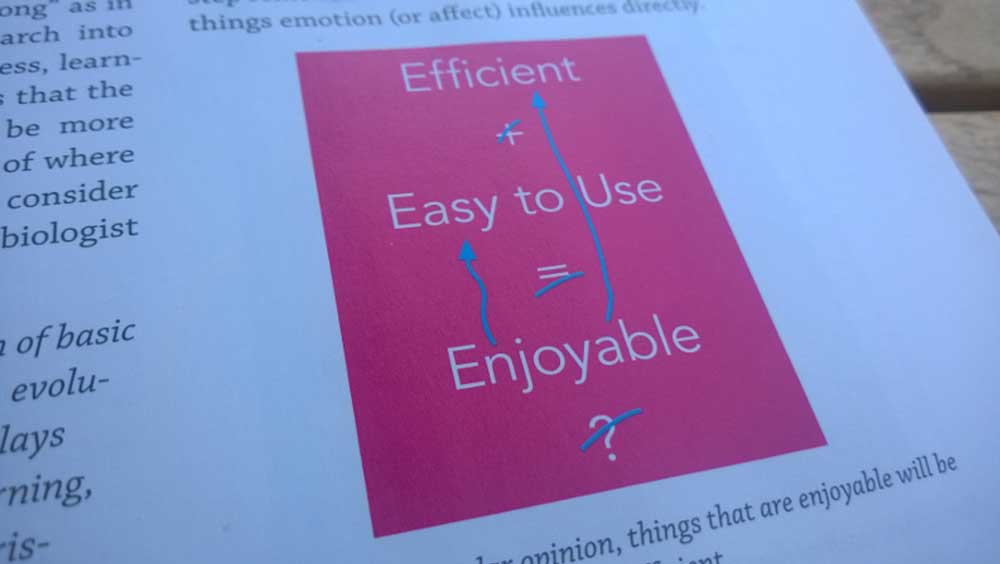
It reflects upon a popular notion that we have in software development and UX. The idea that when you interact with something which is efficient and easy to use, you find it enjoyable as a result. The interesting twist is that the opposite can be true as well, when you interact with something that you find enjoyable (fun, beautiful, etc) you perceive it as being efficient and easy to use.
And this can trascend the world of perceptions. Indeed, another great book “Emotional Design” by paragon of modern cognitive science and user experience, Don Norman, states the following: Attractive things work better. Don points to research done in Japan and Israel where people not only perceived beautiful interfaces to work better, but they also achieved better results in terms of time to task completion and amount of errors.
But why is that?
Why do beautiful things work better?
Because it’s how our brains are designed to work. During the greatest part of our evolution as a species we developed the visceral part of the brain, what we call the lizard brain, to keep us alive.
That subconscious, fast thinking and reacting part of our brain is the one that kicks in to save the day when a crazy guy comes at you wielding an axe:
And even though we’re not living in the same extreme environment as our ancestors - with axe wielding crazy men surrounding us - , we still rely heavily on this part of the brain, even when we don’t need to, like when you are going on a date, or when you are giving a speech.
This visceral brain is always the first thing to get triggered whenever we interact with a person, a device or a web application. Before we even think about its usability, or usefulness, or its content, our subconscious lizard brain has already made a decision about whether we like it or not. And that feeling is going to carry through and affect all our future interactions with whatever we’re interacting with.
So when you engage with someone or something that you find attractive, pleasing or appealing, that positive emotion, that happiness, is going to carry through your interaction.
At the same time there’s research that shows that happy people are more capable of thinking creatively, and therefore more effective at finding solutions. Moreover they are more tolerant to minor difficulties, and more eager to forgive flaws in usability. A psychologist called Alice Isen proved this by setting a task to a group of people, one that required uncommon amounts of out of the box thinking. Alice demonstrated that giving a small gift to a person, and making that person happy, resulted in awesome results in how that person approached the task.
On the opposite side of the spectrum, unhappy people think less creatively, develop tunnel vision, upon mistakes they’ll just try to do the same thing, fail again, get more frustrated… and throw the computer outside of the window.
So, in summary, we can say that attractive things make you feel good, which in turn makes you think more creatively, which in turn improves your user experience.
An interesting corollary or side thought that comes out of this, is that beauty can compensate for average design, function and usability. Not that you need to choose, the goal should be to have beautiful aesthetics, good design and thoughtful usability. But it is interesting to contemplate as aesthetics are often overlooked and left for last when developing applications (at least in my experience as a software developer). Having said that, we shouldn’t take things to the extreme as beauty can’t compensate for a completely broken product.
Ok so Beauty is good, beauty is important, beauty improves User Experience but…
Designing Beautiful Applications is Hard
Making beautiful things is not easy. You, reading this, are likely a software developer. And there’s a high chance that you are a full stack developer in charge of a whole application from database to UI. So it’s naturally hard to, on top of that, expect you to be be a super gifted designer, or to be well versed in cognitive science, human psychology or user experience. Or You may be awesome at design and user experience but you don’t have all the time in the world to invest in making things beautiful as aesthetics are often not prioritized.
That’s why it is awesome to take advantage of existing visual languages like Material Design.
Behold! Material Design!
Material design is a complete design language that helps you build beautiful applications. It was developed by Google with two goals in mind:
- To synthesize thousands of years of good design with the innovation of technology and science
- To provide a unified experience across a myriad of platforms, devices and ways of interacting
Material Design has three underlying principles that guide the design language and which will help you understand and apply it when you are developing applications. These are:
Material is The Metaphor
Just like in software development we use design patterns to convey a lot of meaning with just a single word (factory, observer, strategy, etc), we can use metaphors for the same purpose. The overarching metaphor of Material design is Material. Material like paper, flesh and bone, wood, kryptonite… And just like material in the real world, Material Design happens in a 3D environment that contains light, material and cast shadows.
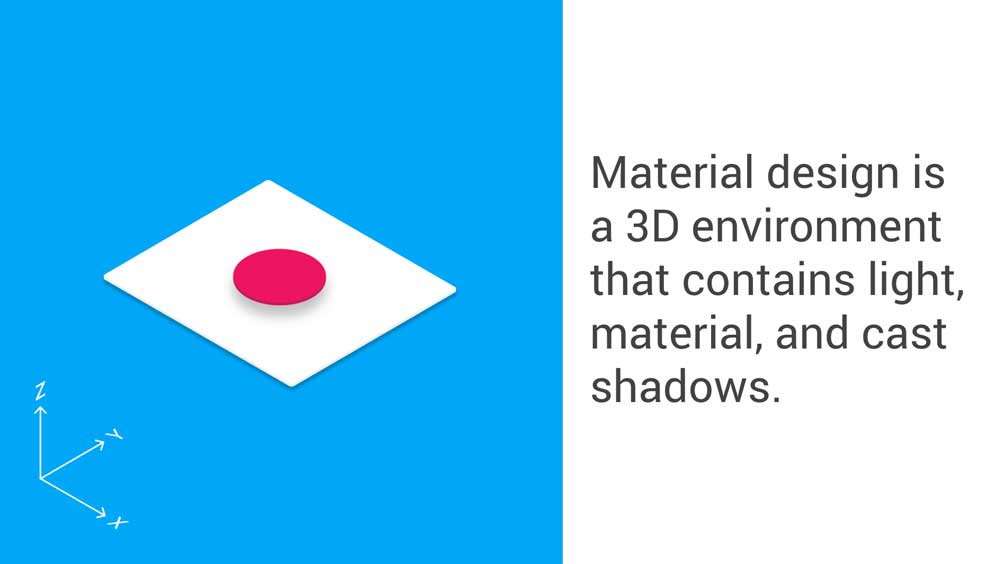
And just like material in the real world, the material within Material design has some immutable characteristics and behaviors. For instance, it is solid, it occupies unique points in space, it’s impenetrable, etc. Think for instance about what you can do with two thin sheets of paper in the real world to make yourself an idea.
Bold, Graphic and Intentional
Material design is very bold in the way it chooses to convey meaning, this can be clearly seen in the color palettes, the aggressive use of whitespace, contrast, large-scale typography, and how the different Gestalt principles are applied within the language.
Motion Provides Meaning
Material design uses motion to convey meaning and function, to support and respond to user interaction and to guide the user between transitions within the application environment. That is, Motion and animations in material design are not something gratuitous, they have a purpose.
In Material Design things move the way they move in the real world, that is, motion feels natural. So much so, that behind Material design lies a physics engine that replicates motion in the natural world.
In summary, Material Design is a complete design language that offers you a thought framework and guidance on anything that you can imagine from motion, style (colors, icons, typography, etc), layout, components, patterns, guides on usability, etc. If you want to find out more about Material design then don’t hesitate to look at the great documentation on material.io/guidelines.
Angular Material
Angular Material brings all the awesomeness of Material Design to Angular. Essentially it is a suite of Material design components for Angular that let’s you quickly create apps that look great on any device (web, mobile, desktop). It’s built by the Angular team and a host of contributors so you can be sure that it will fit great within Angular and perform flawlessly.
Indeed, Angular Material integrates seamlessly with Angular. We can think of any Angular app as a tree of components. Normally you’ll develop these components yourself using the available Angular APIs. When using Angular Material you’ll use your own components in combination with Angular Material components. But since these are just vanilla components they’ll fit perfectly together with your own applications components.
In this series of articles we’ll be creating a simple dating app that could look like this when expressed like a tree:
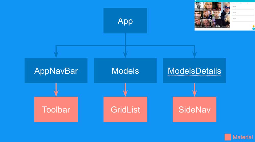
Notice how the Angular Material components are just leafs within the tree. At the end of the tutorial we’ll end up with something like this:
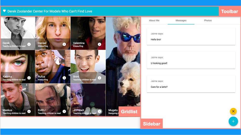
Where each component from the tree has been highlighted.
Angular Flex Layout
In addition to Angular Material, and as a completely separate library, Angular also provides a layout engine for your Angular apps: Angular Flex Layout. It is based on CSS flexbox and just like flexbox it helps you create flexible and responsive layouts. Instead of the familiar CSS properties Angular Flex Layout provides a declarative API in HTML that fits perfectly with Angular template syntax.
If you haven’t used flexbox before let’s do a quick summary.
CSS Flexbox is a relatively new layout model that is designed to create user interfaces that automatically adapt to the space available in the screen. Flexbox allows you to define a user interface with elements that can be laid out in any direction and which flex their size to fit your needs: they can grow to fill the space available, have relative sizes to each other, shrink to avoid overflowing the parent or be aligned horizontally or vertically, and all of this can be configured with a very simple API.
Within a flexbox container you define the direction in which you lay out your elements (row or column) and this determines the direction of the main and cross axis. For instance, let’s say that you want to lay out your items within a row. You select the row flex direction and this results in your main axis being the horizontal one, and the cross axis being vertical. You can then use different CSS properties (justify-content and align-items) to align your items in any of these axes. In the figure below (that I’ve taken from the docs) you can appreciate how the items are laid out horizontally and aligned in the center of both axis:
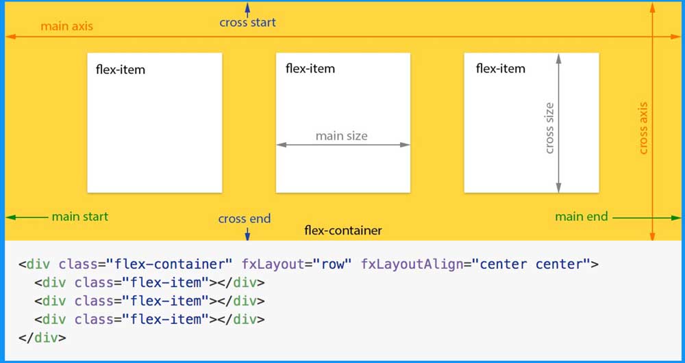
The example below illustrates how you can define this layout with Angular Flex Layout. fxLayout="row" lays out the flex items horizontally within a row and fxLayoutAlign="center center" aligns them in the center of both the main and the cross axis:
<div class="flex-container" fxLayout="row" fxLayoutAlign="center center">
    <div class="flex-item"></div>
    <div class="flex-item"></div>
    <div class="flex-item"></div>
</div>
Making a responsive layout with Angular Flexbox is as easy as reusing the same API with breakpoints for different device sizes: xs for extra small devices, s for small ones, and so forth. A simple responsive layout could look like this:
<div class="flex-container"
     fxLayout="row"
     fxLayout.xs="column"
     fxLayoutAlign="center center"
     fxLayoutAlign.xs="start">
    <div class="flex-item"></div>
    <div class="flex-item"></div>
    <div class="flex-item"></div>
</div>
For small devices like smartphones the layout above will change from row to column, that is, the items will be laid out vertically. Additionally, instead of aligning the items in the center they’ll be aligned starting from the top by virtue of using start as the alignment for the main axis (note that the main axis changes based on fxLayout that is now column).
If you’d like to learn more about how Angular Flex Layout don’t hesitate to take a look at the docs. And if you want to learn more about flexbox I wrote a thorough tutorial with several examples in this very blog.
Time For Some Coding!!
In the next part of the series we’ll start coding our dating app: Derek Zoolander’s Center for Models Who Can’t Find Love.

Written by Jaime González García , dad, husband, software engineer, ux designer, amateur pixel artist, tinkerer and master of the arcane arts. You can also find him on Twitter jabbering about random stuff.
